

HISTORY
Photography has come a long way from the early days of sepia tinted images and cyanotypes which we are all familiar with to where anyone can print a colour photo on their home printer in seconds.
Colour photography and film weren’t really common until the sixties and most people shot in black and white. Since then, a debate has raged between people who believe black and white images convey more emotion and atmosphere and those who prefer colour.
In the UK, the first colour newspaper was “Today” launched by Eddie Shah in 1986. I remember growing up that printing colour films was much more expensive than b/w. Nowadays unless you use C41 b/w film it can be difficult (and costly) to find someone to process your b/w films for you. We’ll cover film and film processing in a later post.

Personally about a quarter of my images are b/w and the rest colour. But it’s interesting that many portraits, urban and architectural images look better in b/w than colour. I also find minimalist images of flowers look good without colour.
The decision whether to go for colour or not can depend on many factors. Sometimes colours may clash which can be jarring,

Or perhaps there are limited colours in an image but a wide range of tones – both these cases could lend themselves to b/w processing;


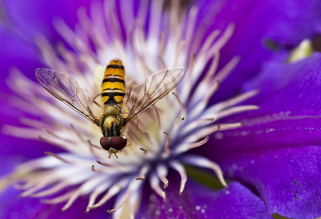
Alternatively, colour contrast in an image can really make the subject stand out and improve the shot. If you’re not familiar with a colour wheel you should be – opposite colours are contrasting but can work well against each other in the right context like the shot of the hoverfly at the top of this post.

http://www.colormatters.com/color-and-design/basic-color-theory
WHITE BALANCE
Getting your camera to recognise the right colours is important. The strength, quality and source of the light you are shooting under can really impact how your camera sees colours. We talked a bit about colour temperature and White Balance back here.
The best option for ensuring correct white balance is to shoot in Raw and then adjust the temperature in post-production if you need to. But this is not always possible if you use a mix of lights that give off different colour temperatures – such as tungsten bulbs and flashes. The most accurate way is to shoot with a custom white balance.

The above image was shot in daylight but with the camera set to tungsten, which gave the shot a bluish tint. Tungsten lights are very orange and so with a tungsten white balance, the camera deliberately makes the image bluer to counter this – orange and blue are opposite on a colour wheel.
When you are actually shooting in daylight, the blue toning gives a very different look.
Colour rendition goes even further – different monitors can show colour differently, although you can go some way to correcting this with monitor calibration tools. Different printers will also deliver different colours, especially if you use the wrong colour space settings when saving your images.
MANIPULATING COLOUR
With modern post processing tools you have lots of ways to adjust the colours in an image – not simply choosing colour or b/w. Selective colour is one way to use a specific colour or area of colour to focus attention in an image.

One of my favourite tools is Cross Processing;

You can darken and partially desaturate an image to produce a more ‘grungy’ effect.

Or go the other way and use HDR imagery to bring out a full range of colours and tones, as in this recent shot

There are a world of possibilities.