As a follow-up to my post about the most expensive photographs ever sold, I thought I’d take the opportunity to talk a bit about what makes a great photograph – and perhaps more importantly, what can spoil one.
This is my most-viewed photograph on Flickr.

There are many factors that go to making a good photograph – if you ask 10 people you’d probably get 12 different answers.
A podcast that I listened to a while ago listed six factors, five of them technical and the last one more subjective, that they thought contributed to a great picture;
- Focus – What part of the frame is in focus, is it in focus, and what has been blurred.
- Exposure – Are there parts of the picture that are ‘blown out’ and pure white or lost to complete black? Is the overall shot too light or too dark?
- Depth of Field – How far does the focus extend within the shot? Is the background blurred to isolate the foreground or still in focus and distracting?
- Contrast – Is there a good mix of light and dark or does the image seem ‘flat’? Complimentary colours can give a good (or bad) colour contrast.
- Colour – Do the colours work well together? In a black and white image, are there different grey tones or does it look monotone?
- Composition – What is in the frame (and what isn’t)? How is it arranged? Is the choice of horizontal (landscape) vertical (portrait) or square image correct? Is there a story or narrative? Is it original or clichéd?
I’ll go into more detail on each of these factors in later posts but for now, you might want to keep these in mind when taking your shots.
Depending on the type of image you are making, the order of importance of these six factors will be different and some may not be relevant at all. All of them can be modified in post-processing to some extent depending on your computing skills, the software you have and how far you need to push it.
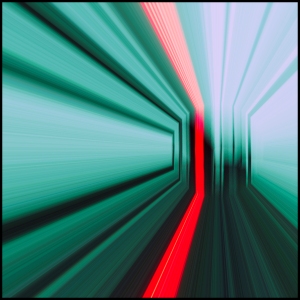
This is my most commented on photo on Flickr – how is the exposure, focus and depth of field working for you here?!
Last year I was asked to judge a photographic competition for The Photographic Angle and had to evaluate over 1000 entries to pick a winner. To do this, I went through each of the pictures and typically eliminated entries that had problems with one or more of the technical factors. It’s surprisingly quick to do this – in fact it should be – if you have to spend time thinking about whether an element is wrong then it probably isn’t.
When I came to an image that passed the technical elements, I could spend a bit longer on the composition and narrative. This is where it gets more difficult because what is appealing to one person isn’t to another – beauty is in the eye of the beholder – but for most photographs it is the composition that ultimately makes a great shot.
Of course there are some technical aspects to composition too – use of leading lines, “rule of thirds”, “golden ratio”, use of symmetry and patterns, framing etc. and I’ll cover this in later posts too but these are really just guides not hard-and-fast rules.
You can read my critique of the winning entries to get an idea of what I was thinking and why I selected the images that I did here.
As for what I think makes a good picture – the basic foundations have to be right, the technical elements – but in the end it’s down to you. If you like it, then that’s all that matters.